Introduction
The Red Pitaya is a great tool for simple oscilloscope applications and waveform generation. This allows a great number of experiments that can be found all over the web. However, because of the limited number of samples it also has its limitations but at a price of > 300€ one should not complain.
Although it is a low-cost piece of equipment, it can also be used for serious lab work, as you will see in this article.
In order to analyze the performance of our amplifier circuits (as well as any other circuit with possibly noisy output), we were looking for an inexpensive solution that would provide a way to automatically measure the noise spectrum while being as good as expensive devices (> 10k€).
As we have received some requests as to how this can be done, we would like to share this information so that you do not have to reinvent the wheel.
Here you can download the necessary files: ZIP
Connection to the SCPI Server
We provide you with a complete iPython notebook that you can download and adapt to your Red Pitaya and measurement needs. The notebook has to be run from your computer and will communicate to the Red Pitaya via SCPI. For this to be possible you have to switch on the SCPI Server of the Red Pitaya:
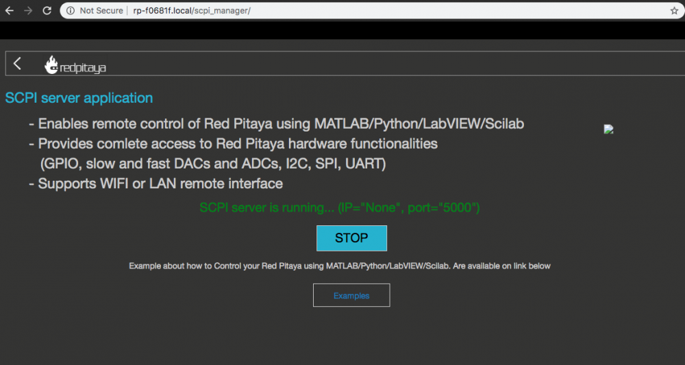
After doing this you might want to find out the IP-Address of your Red Pitaya if not displayed (as shown here):

Now lets move to the Jupyter notebook/lab browser environment or any other python development IDE. I assume that you have this running already. If not, you will find enough resources on the web explaining you how to install Anaconda or another python distribution including an IDE in detail.
It all starts with some imports and setting the IP address of your Red Pitaya. Make sure that you have switched your SCPI server on (as shown in figure 1) before running this:
#necessary modules to import
import sys
import time
import redpitaya_scpi as scpi
import matplotlib as mpl
import matplotlib.pyplot as plt
import numpy as np
import pandas as pd
#create the instance of the scipy server
#TODO put in your correct Red Pitayas IP-Adress here
rp_s = scpi.scpi('169.254.40.116')
If something crashed here, it means most probably that you don't have all the packages installed. Make sure you have the redpitaya_scpi.py module which is included in the zip file for download in the same directory as your code file.
Prescaler and Data Acquisition
Next, set the prescaler that determines the frequency range to be observed. The Red-Pitaya will always acquire 16384 samples and its clock runs at 125 MHz. So with a prescaler of 8192 we will see:
16384 samples / (125 * 10 ^ 6 Hz) * 8192 = 1,073 seconds. Therefore the minimum frequency you will get is 1 / 1,073 s ~ 1 Hz. The upper frequency you can observe is determined by the time step
16384 samples / 1,073 seconds = 15,269 kHz which has to be divided by two because of the Nyquist theorem. So the maximum observable frequency is 7,6 kHz. By changing the prescaler you can access different frequency ranges:
| Prescaler Setting | Acquisition Time | Frequency From | Frequency To |
| 8192 | 1073 ms | 1 Hz | 7,6 kHz |
| 1024 | 135 ms | 7,5 Hz | 122 kHz |
| 64 | 8,3 ms | 119 Hz | 1,95 MHz |
| 8 | 1 ms | 1 kHz | 15,6 MHz |
| 1 | 0,131 ms | 7,6 kHz | 125 MHz |
#set the prescaler according to the frequency range you want to observe.
#the number 8192 will give you a freq. range from 1 Hz to 7 kHz
prescaler = 8192
rp_s.tx_txt('ACQ:DEC ' + str(prescaler))
rp_s.tx_txt('ACQ:DEC?')
#make sure the prescaler was set
display('Prescaler set to: ' + str(rp_s.rx_txt()))
Now we can already start collecting data. Remember we are looking for noise so we have to connect our circuit to the Red Pitaya, switch it on and possibly shield it from environmental noise (e.g. with aluminium foil). Also be aware that in the meantime there are no other tasks running on the Red Pitaya. You could possibly start the Scope app during the measurement but this would certainly disturb your measurement. So do not try to do something on the Red Pitaya during that time.
The Acquisition will be done on Channel 1 (ACQ:SOUR1:DATA). If you want to acquire on Channel 2 you have to change the text to ACQ:SOUR2:DATA. Make sure your inputs are set to LV mode (0-1 V range) via the jumpers at the Red-Pitaya circuit board.
Let's go on with the code:
#prepare some arrays
buff_ffts = pd.DataFrame()
buffs = pd.DataFrame()
#the number of averages will determine the quality of your noise spectrum
#keep the number around 10 in the beginning not to wait too long and increase it if you are sure everything works
numOfAverages = 10
#the offset takes a certain number of spectra in the beginning.
#Sometimes the Red Pitaya produces trash in the first spectra
offset = 5
#do the acquisitions and save it in the computers memory (not on the Red Pitaya).
for i in range(1,numOfAverages+offset):
 if i % 50 == 0:
 display(i)
 rp_s.tx_txt('ACQ:START')
 rp_s.tx_txt('ACQ:TRIG NOW')
 rp_s.tx_txt('ACQ:SOUR1:DATA?')

 buff_string = ''
 buff_string = rp_s.rx_txt()
 buff_string = buff_string.strip('{}\n\r').replace(" ", "").split(',')
 #display(buff_string)
 buffs[i] = list(map(float, buff_string))
 buff_ffts[i] = (np.fft.fft(buffs[i])/16384)**2
You can see that we have introduced an "offset". In principle it should not be necessary. It is there because sometimes the Red Pitaya creates some trash acquisitions in the very beginning. We observed this when other things were still running on the device. Just keep it in mind and watch the 5th trace you recorded and see that you only have noise here:
xVect = np.arange(0,prescaler/125e6*16384,prescaler/125e6)
'''Plot the 5th buffer to see if everything is fine'''
fig, ax = plt.subplots(dpi=72*2)
ax.plot(xVect*1000,buffs[5]*1000, label='', lw=1)
ax.set_title('Red Pitaya Test2');
ax.set_xlabel('time [ms]')
ax.set_ylabel('voltage [mV]')
plt.show()
This should produce a graph like this:
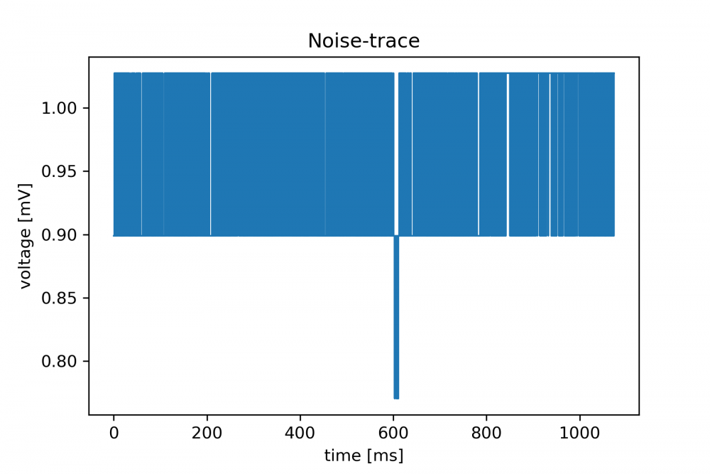
The for loop in the upper code part puts all data into a large array and already performs the FFT. Please note that in
buff_ffts[i]
you obtain your power spectral density in the unit of V2/Hz with a positive and a negative frequency component. The scaling factor here is the number of samples. If you did not have 16384 samples but a different number you would have to devide by this number instead.
The string and map operations are just to clean up the data and transform it to float numbers. You can insert a display command in every step if you are interested.
Getting the power spectral density (PSD) and voltage noise density (VND)
Now that we acquired all the data we can display the voltage noise density in the unit of V/√(Hz). We have a two sided power spectal density in buff_ffts in our memory. There are numOfAverages+offset spectra waiting to be averaged together:
#determine the timestep to calculate the frequency axis
timestep = prescaler/125e6
#get the frequencies
freq = pd.Series(np.fft.fftfreq(16384, d=timestep))
freq2plot = freq[0:int(freq.size/2)]
#get the first usable spectrum into the result variable
result = 2*np.abs(buff_ffts[1+offset][0:int(freq.size/2)])/numOfAverages
The first two lines just calculate the frequencies that we will later plot. The next line will put one spectrum inside the result variable. In this case its the 6th spectrum because 1+offset = 6. We scale the height with the number of averages for a reason that will be explained two lines below.
Note the factor 2 that we have to take to compensate for the fact that we only take one side of the spectrum. The spectrum is symmetric around zero and we only take the positve frequencies. As long as we multiply by two we compensated for that.
for i in range(2+offset,numOfAverages+offset):
    result = result + 2*np.abs(buff_ffts[i][0:int(freq.size/2)])/numOfAverages
Now we averaged all spectra in units of V2/Hz and every spectrum is scaled with the number of averages. Thus, the absolute height does not change if we take 10 or 100 averages. This is of course important for absolute comparison. Remember that we omit the first spectra because there might be trash inside.
resultV2perHz = pd.DataFrame({'Freq': freq2plot, 'FFT': result})
resultV2perHz.to_csv('Circuit_V2_per_Hz.dat')
Lets save the data to a file just not to loose all the hard work when the notebook is shut down. Pandas comes in very handy with the to_csv method. Now we want to plot our results
fig, ax = plt.subplots(dpi=72*2)
ax.plot(freq2plot, np.sqrt(result), label='Current Circuit', lw=1)

ax.set_title('Noise Amplitude Spectrum (' + str(numOfAverages) + ' AVG)')
ax.set_xlabel('Freq [Hz]')
ax.set_ylabel('Noise ampl. [V/$\sqrt{Hz}$]')
ax.set_yscale('log')
ax.set_xscale('log')
ax.set_xlim(1, 1e4)
ax.legend(loc='upper right', bbox_to_anchor=(1, 1), prop={'size': 8})
plt.show()
Lets see what we have:
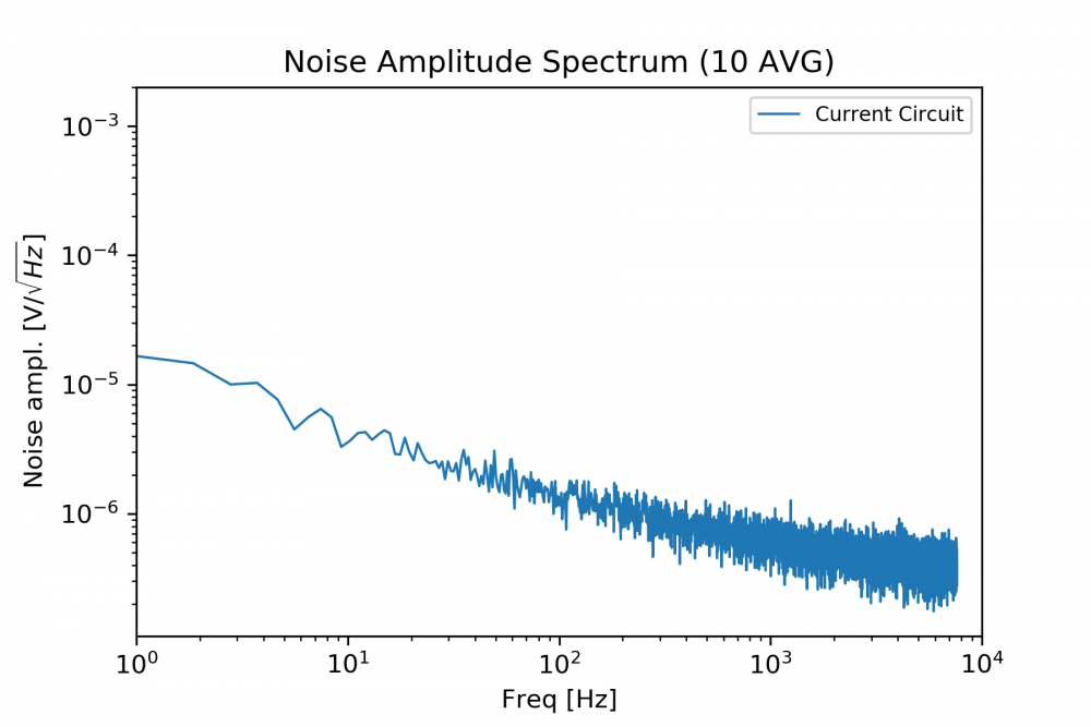
We take the square root of the PSD to obtain voltage noise density in units of V/√(Hz). This is what is given in most datasheets for electronic amplifiers so we want to display it. This also gives a more direct "feel" for the amount of noise that can be seen on an oscilloscope.
Optimization of your circuit
The quality of the noise spectrum obtained with the Red Pitaya can be improved by taking more averages (which will also take longer) and this will peel out more features. We had the chance to compare our results to a professional, expensive FFT-Analyzer found the results to be equal within the error limit of the ADCs. So the Red Pitaya does a good job here although it does not have the dynamic range of more expensive devices. For our purposes this does not matter since almost all our noise spectra can be handled. With the currently available 16 bit version the dynamic range will be even better than with the 12 bit version we are using here.
If you want to measure the noise of your circuit you simply connect it to the input of the Red Pitaya and you will find the respective noise figures of your devices. Keep in mind to use a LV jumpered input. Here an example:
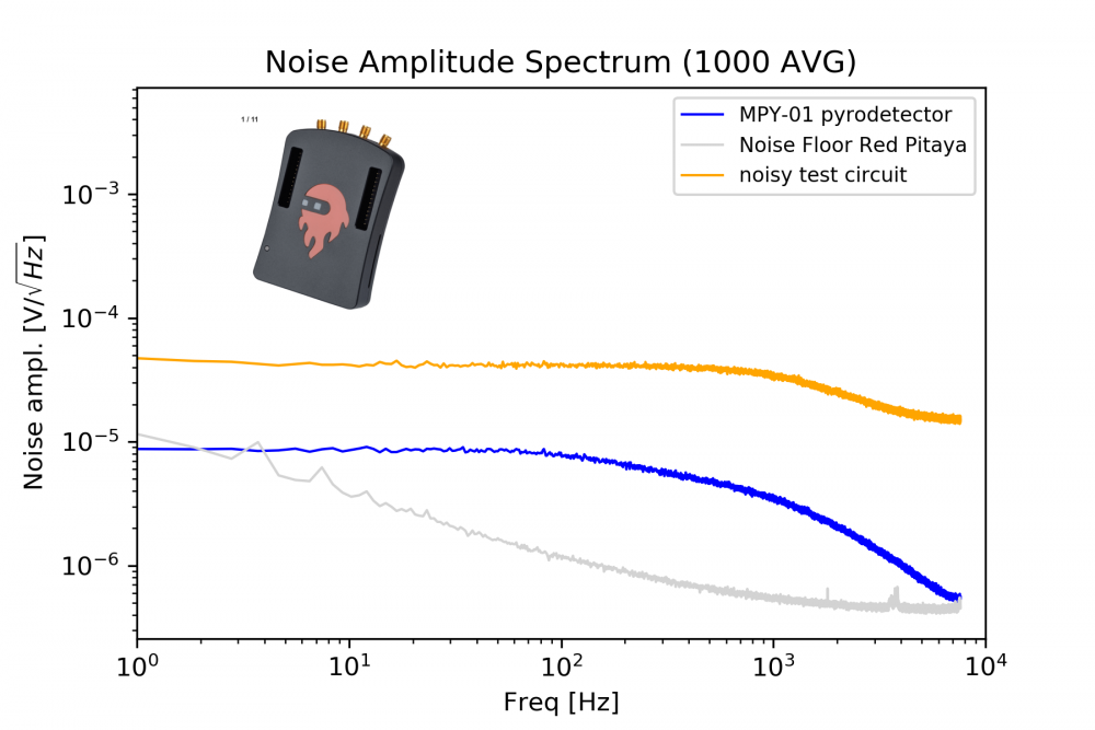
Figure 5 shows you the noise floor of the Red-Pitaya (1000 times averaged - gray) as well as the noise of two test circuits (blue and orange). The noise of the "noisy test circuit" (orange) is approx. 10 times higher than the noise floor of the Red-Pitaya so you can trust the results and you are done. Congratulations !
Troubleshooting
Starting your Red-Pitaya FFT-Analyzer might give unwanted results in the beginning. You might find severe 50 Hz noise as shown here:
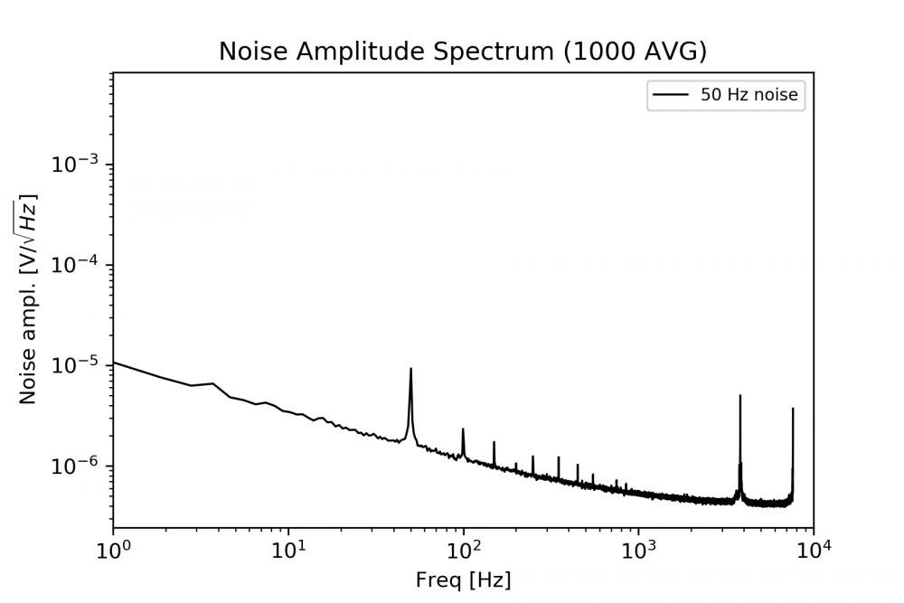
To solve this problem, its a good idea to wrap the Red-Pitaya in aluminum foil and to ground the aluminum foil properly. It is even better if you buy a good metal case for your device if you do not have it yet. Furthermore it is important to have no strong noise sources close to your Red-Pitaya like old screens, power supplies, motors or other radiating equipment. You should put the Pitaya in an electromagnetically quiet environment. This will do the job. We have done it and you will do it too, if you have come this far. However, we could not get rid of the small bumps you see in Figure 5 at 4 kHz and close to 2 kHz.
Measuring low noise sources with the Red Pitaya
If the noise of the circuit you want to measure is close to the noise floor of the Red-Pitaya, things can become a bit more difficult (see blue curve in figure 5). The noise of the MPY-01 detector is below the noise floor of the Red-Pitaya at very low frequencies (~1 Hz). This is not a mistake or a sampling inaccuracy. We did this measurement by amplifying the noise of the MPY-01 before sending it into the Red-Pitaya and then dividing by the amplification factor. This requires an extremely low-noise operational amplifier circuit. We plan to illustrate this more in another tutorial. If you already have questions about this, just ask us by email and we will help you.
